Using Pinia to Create Reusable Modal in Vue 3

Introduction
Modal is a crucial website component, often used to improve user experiences. Frequent use can be significant, necessitating repetitive creation of modal instances. To overcome that problem, we can possibly make the instance to be reusable using Pinia.
Why do we use Pinia?
As per official Pinia Website:
Pinia is a store library for Vue, it allows you to share a state across components/pages. If you are familiar with the Composition API, you might be thinking you can already share a global state with a simple
export const state = reactive({}).
The Problem
Many of us likely still open Vue.js modal components using this method:
<template>
  <button @click="openModal">Open</button>

  <Transition>
    <Modal @close="closeModal" v-model="isModalVisible" />
  </Transition>
</template>

<script setup lang="ts">
import Modal from './components/Modal.vue'
import { ref } from 'vue'

const isModalVisible = ref<boolean>(false)

function openModal() {
  isModalVisible.value = true
}

function closeModal() {
  isModalVisible.value = false
}
</script>
The example above has a downside. Each time you want to use the modal, you must import and call the Modal Component simultaneously. This goes against a fundamental principle of software development: DRY (Don't Repeat Yourself).
As per Wikipedia:
"Don't repeat yourself" (DRY) is a principle of software development aimed at reducing repetition of information which is likely to change, replacing it with abstractions that are less likely to change, or using data normalization which avoids redundancy in the first place.
Pinia: The Solution
Here is when Pinia take control of it. With it, we can create a store to make modal instance reusable.
Initialization
First thing first, you need to install Pinia on your vuejs project:
yarn add pinia
# or with npm
npm install pinia
Then, create a pinia instance and pass it to the app as a plugin in your main.js or main.ts (if you're using Typescript).
import { createApp } from 'vue'
import { createPinia } from 'pinia'
import App from './App.vue'

const pinia = createPinia()
const app = createApp(App)

app.use(pinia)
app.mount('#app')
Defining A Store
Now, create a folder name stores. Then create a file inside it name useModalStore.ts
To define a store, we will import defineStore from pinia and we will create a state and some actions inside it.
First, we will create a state for the useModalStore:
import { defineStore } from 'pinia'
import { ref } from 'vue'

export const useModalStore = defineStore('modal', () => {
  const initialState = {
    component: null,
    componentProps: {}
  }

  const state = ref({ ...initialState })

  return {
    state
  }
})
Then for the actions, we will create a function to open and close the modal:
import { defineStore } from 'pinia'
import { ref } from 'vue'

export const useModalStore = defineStore('modal', () => {
  const initialState = {
    component: null,
    componentProps: {}
  }

  const state = ref({ ...initialState })

  function open (newState: ModalState) {
    Object.assign(state.value, newState)
  }

  function close () {
    Object.assign(state.value, initialState)
  }

  return {
    state,
    open,
    close
  }
})
If you're using Typescript, let's create an interface for state ref:
import { ref, type Component } from 'vue'

interface ModalState {
  component: Component | null,
  componentProps?: Record<string, any>
}
Finally the useModalStore.ts code will look like this:
import { defineStore } from 'pinia'
import { ref, type Component } from 'vue'

interface ModalState {
  component: Component | null,
  componentProps?: Record<string, any>
}

export const useModalStore = defineStore('modal', () => {
  const initialState = {
    component: null,
    componentProps: {}
  }

  const state = ref<ModalState>({ ...initialState })

  function open (newState: ModalState) {
    Object.assign(state.value, newState)
  }

  function close () {
    Object.assign(state.value, initialState)
  }

  return {
    state,
    open,
    close
  }
})
Creating Modal Layout
After we done creating the store. We will create ModalLayout.vue for reusable component.
<script setup lang="ts">
import { useModalStore } from './useModalStore'

// Initialize modal store
const modal = useModalStore()
</script>

<template>
  <div
    v-if="modal.state.component"
    id="modal-layout"
    @click.self="modal.close"
  >
    <!-- Assign component state && component props -->
    <Component
      :is="modal.state.component"
      v-bind="modal.state.componentProps"
      @close="modal.close"
    />
  </div>
</template>

<style scoped>
#modal-layout {
  position: fixed;
  z-index: 1;
  left: 0;
  top: 0;
  width: 100%;
  height: 100%;
  overflow: auto;
  background-color: rgb(0,0,0);
  background-color: rgba(0,0,0,0.4);
}
</style>
Then, import ModalLayout.vue into App.vue
<script setup lang="ts">
import ModalLayout from './components/Modals/ModalLayout.vue'
</script>

<template>
  <nav>...</nav>
    <router-view />
    <ModalLayout />
  <footer>...</footer>
</template>
Next, for the test i've already created a modal component ExampleModal.vue which will be passed inside of ModalLayout.vue.
<script setup lang="ts">
defineEmits(['close'])
defineProps<{
title: string
body: string
}>()
</script>
<template>
<div class="modal-content">
<div class="modal-header">
<span class="close" @click="$emit('close')">×</span>
<h2>{{ title }}</h2>
</div>
<hr>
<div class="modal-body">
<p>{{ body }}</p>
</div>
</div>
</template>
<style>
.modal-header {
padding: 2px 16px;
background-color: white;
color: black;
}
.modal-body {padding: 2px 16px;}
.modal-content {
position: relative;
background-color: #fefefe;
margin: auto;
padding: 0;
border: 1px solid #888;
width: 80%;
box-shadow: 0 4px 8px 0 rgba(0,0,0,0.2),0 6px 20px 0 rgba(0,0,0,0.19);
}
.close {
color: #aaa;
float: right;
font-size: 28px;
font-weight: bold;
}
.close:hover,
.close:focus {
color: black;
text-decoration: none;
cursor: pointer;
}
</style>Last but not least, we will create a function to call the ExampleModal by calling the open actions from the useModalStore.ts:
<script setup lang="ts">
import { useModalStore } from './useModalStore.ts'
import ExampleModal from './ExampleModal.vue'

const modal = useModalStore()

function openModal () {
  modal.open({
    component: ExampleModal,
    componentProps: {
      title: 'This is the title',
      body: 'Some text in the Modal Body'
    }
  })
}
</script>

<template>
  <div>
    <button @click="openModal">Open Modal</button>
  </div>
</template>
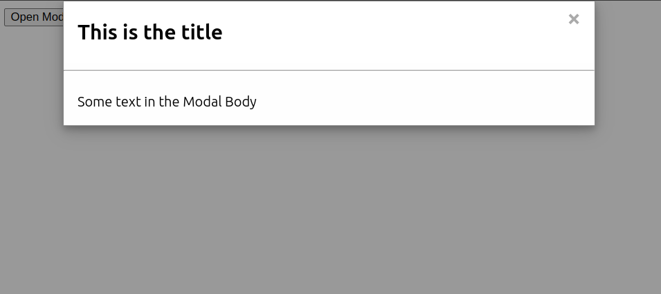
And when the Open Modal Button is clicked, this are the result:

And finally, when we click the close button or clicking outside the modal card, the modal will close itself.
Conclusion
In this article, you have learned how to create reusable modal in vuejs using pinia store. I hope this will helps to your coding things.
Live demo: Reusable Modal Pinia Demo